Farrow & Ball: Colour as a content creation source?
IN A NUTSHELL:
Colour is becoming one of the most interesting sources of inspiration and content creation for brands. A universal concept that calls for it to be explored, shared and showcased as part of the global proposal that brands offer today.
THE GREAT STRATEGIC TAKEOUT:
We must highlight and share the choice, process, nuances and content behind the colour selections carried by our products and brands.
Why should I read this?
The new post-COVID reality has a direct effect on the need for brands to share their truth, their processes and the way in which these decision benefit consumers. Colour is a key resource that we often overlook.
What are we talking about?
The use of colour goes far beyond the need to differentiate our packaging, give “uniformity” to our messages and associate products with the benefits we want to convey (naturalness, luxury…).
Behind colour there is great symbology that calls for us not only to understand it, but also to integrate it into our discourse and make it a strategic element of our decisions and plans for content and communication.
Colours speak; they tell us things. Just like smells and textures, colours have a huge capacity to transmit empathy, to inspire or to transport us to specific moments and evoke universal sensations and emotions.
At best, we trust in the skill of art directors or designers who are responsible for shaping our decisions, expressions and products. At worst, we are guided only by the need to “appropriate” a colour in the categories in which we operate.
In any case, we overlook an abundant source of content that will help us to connect and maintain valuable dialogues that enrich our relationships with our audiences.
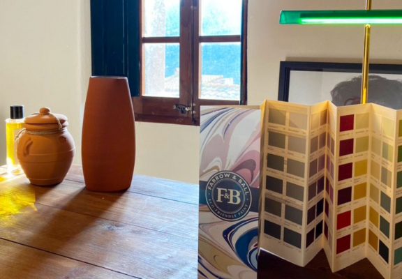
Farrow & Ball is a British paint brand that has made the description of its colour palette one of the key sources of its differentiation. Beyond their skill in selecting, curating and combining colours, we must look at the emotionality they bring to bear when they explain what makes them special.
Links and what to focus on:
- Tone and emotions that is uses
- Way of empathising with consumers who directly buy a product that is usually bought through an intermediary.
- Ability to link needs and motivations (inspire, aspire, project…) to the description of their colours.
WHY YOU SHOULD BE INTERESTED:
Colour is at the heart of all our decisions, from the essence and values of our brand, to the colour of our products and the packaging. Colour choices are key, and they conceal certain content that we could share with our audiences.
What tension does it relieve?
Learn more. Product truth. Consider consumer “insiders”.
From a strategic perspective:
Colour is a much more strategic element to which we often do not give the necessary importance and depth. Nor do we share it or explain it in an emotional way that helps engage our audiences. Colour allows us to expand the values of our brand, associating ourselves with the values emitted by the colours and nuances selected.
Who might be interested?
Everyone, especially if we show the colour selection so that all our audiences can also share it with their networks.
Where do I implement it?
Selection process for new packs, brand identities, variants/ranges.
Communication and content.
How do I implement it?
Detailed and informative content that invites those who read it to integrate it into the narrative. Using references known to all your audiences. Showcasing the selection and the contrasts between colours, and helping to understand the knowledge and métiér behind those decisions.
How innovative is it?
The use of colour as a strategic tool in a textured and detailed way is rare outside the categories in which colour is key (fashion, decoration). Mirroring these categories and taking advantage of them can differentiate us and help us find suitable content and tones.
Key concepts:
Colour, palette, content, insider.
I WANT IT FOR MY COMPANY/BRAND. WHAT DO I NEED TO KNOW?
Who is using it already?
Large decorating and fashion brands, which use colours as an essential tool not only to differentiate their products but also to give an emotional meaning and to conceptualise their collections and proposals.
Things to keep in mind:
The world of colour is subject to significant cultural differences. Like smells and textures, certain colours (especially those that are more complex) mean different things in different cultures. These variants must be documented and understood.
How do I get a clearer idea?
- Review the Farrow & Bell website, buying its colour chart.
- Read https://www.phaidon.com/store/art/chromaphilia-9780714873510/
- Watch https://www.youtube.com/watch?v=JJAUTPtppYY
How do I share it with my network?
“It is possible that we can use the colour of our brand/products to feed our story, build differentiation, share our intentions/emotions”